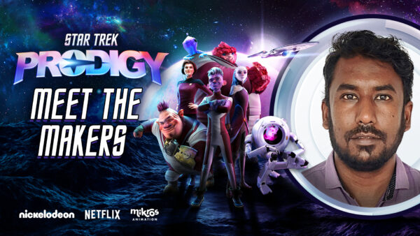
In the realm of animation, the magic we see on screen is a result of countless hours of creativity, technical expertise, and seamless collaboration. One of the talented artists behind the magic of Star Trek: Prodigy is Taniya Gupta, a Lighting Render Comp Artist at Mikros Animation in Bangalore. In this interview, Taniya shares her experiences, the challenges she faced, and the creative process that goes into making such a visually captivating series.
- Were you already familiar with the Star Trek universe before you started work on the series?
This is my first time experiencing this series!
- Can you talk about the creative process behind the animation of “Star Trek: Prodigy”?
It’s been a great experience working on this project. When I first saw the concept art from the creators, I was impressed by the quality and colors. The challenge for me was figuring out how to translate this artwork into CG 3D. I arranged several lights, created various passes, and then integrated everything in compositing. Leveraging my skills, I successfully visualized the final result on screen.

- What were the biggest technical challenges you faced for both seasons of the series?
Visualizing the vast Milky Way and the expanses of space in my mind, and translating their beauty into the final output, while working on the elaborate spaceship designs and portal effects, was a challenging task for me. It required a deep understanding of both the technical aspects and the artistic vision to capture the essence of space. I had to ensure that the visual effects were not only stunning but also consistent with the Star Trek aesthetic, which involved a lot of experimentation with lighting, textures, and compositing techniques. The goal was to create a seamless and immersive experience for the audience, making them feel as if they were truly journeying through the cosmos.
- How did you approach the design of the settings and environments to faithfully reflect the aesthetic of the Star Trek universe while bringing a unique touch to “Prodigy”?
I followed a balanced workflow throughout this project, beginning with a comprehensive understanding of the theory behind spacing through thorough research. I collaborated closely with teammates to establish a cohesive color palette for the entire season. Additionally, I integrated new visual elements strategically to enhance the aesthetic appeal of scenes, ensuring a harmonious and visually engaging outcome.
- Can you share details about the technology and software you used?
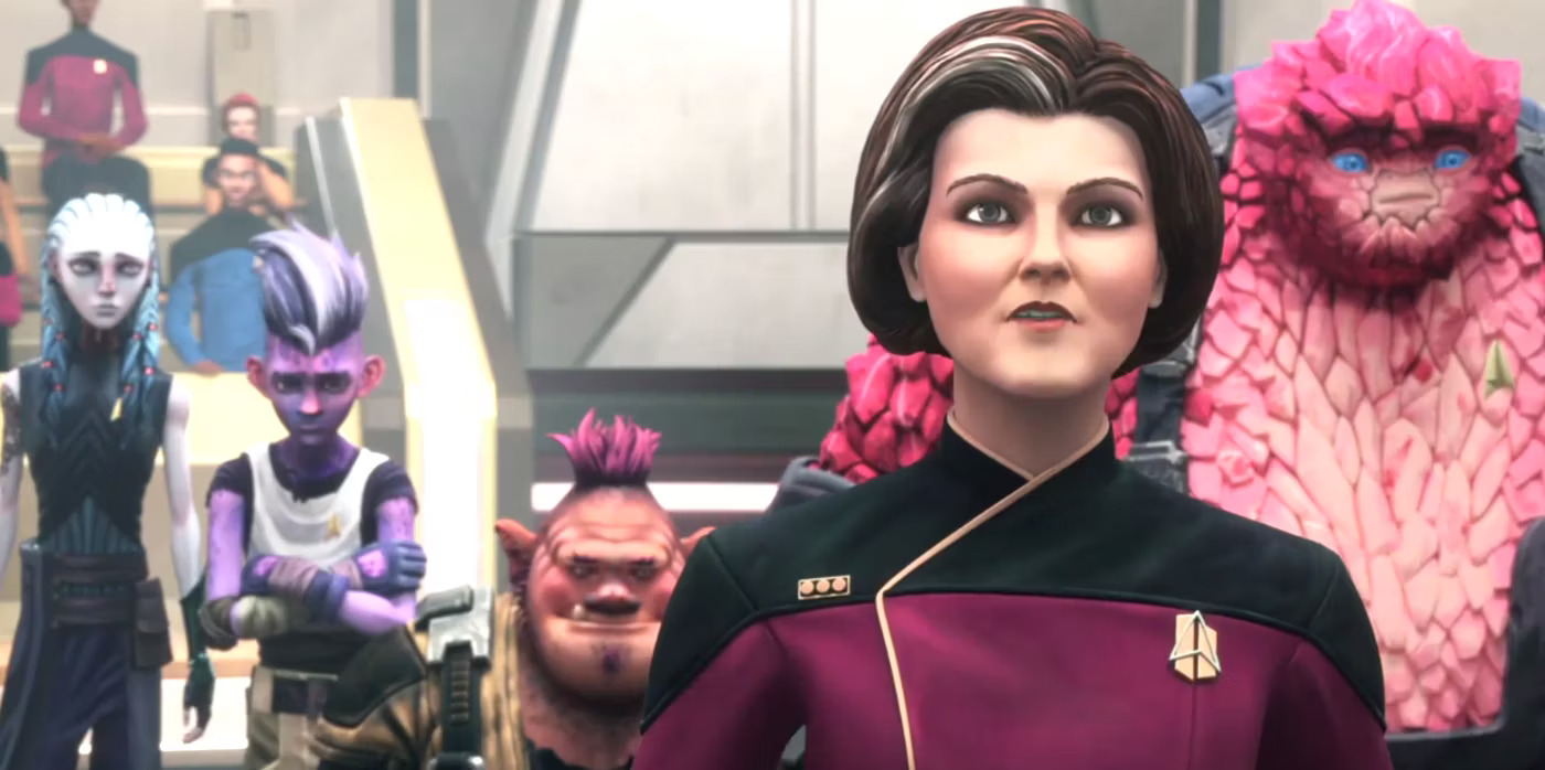
We used multiple software tools to create this piece of art, including Autodesk Maya, Nuke, Substance 3D, Houdini, etc.
- Which characters, scenes, or sequences are you most proud of in “Star Trek: Prodigy,”?
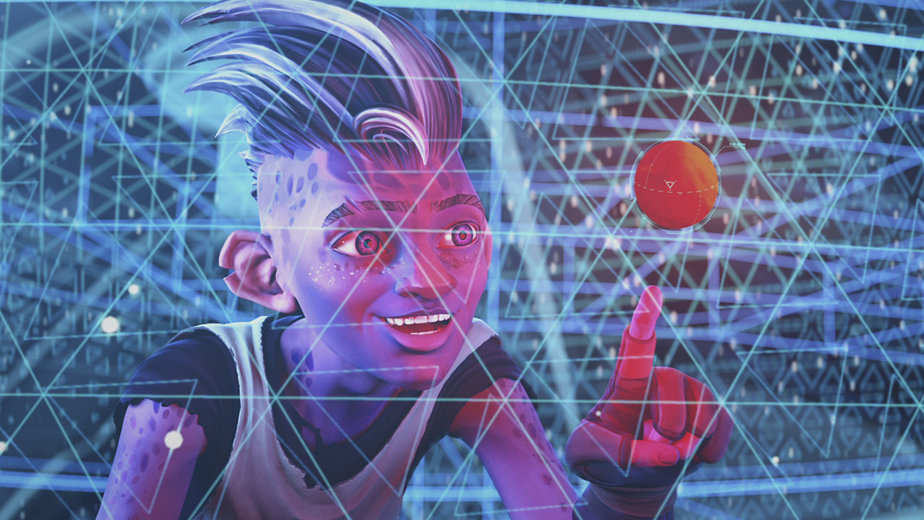
The character I love the most is “Dal” because he is good-hearted and is the one who brings the team together, never letting them down when it’s most needed.
- How did your team manage visual and narrative continuity across different seasons and episodes?
Before production begins, we go through the storyboard and script of each episode. This ensures that key visual elements and narrative beats are planned in advance, helping to maintain consistency.
- What lessons or insights did you gain from working on this project that you plan to apply to your future projects?
The beauty of this project has boosted my creativity. The challenging nature of the work has given me confidence that I can excel in any project. I especially admire the colors and contrast, which I intend to integrate into my upcoming projects.
