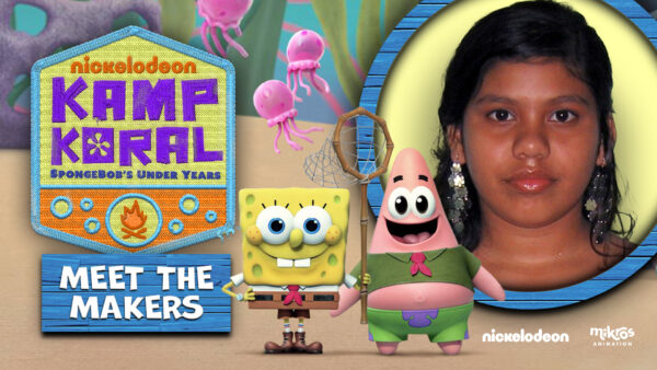
In this interview, we speak with Chandhinirajan B., a Junior Artist involved in animating Kamp Koral: SpongeBob’s Under Years. As the series marks its 25th anniversary, we explore the techniques, collaboration, and challenges that define the show. Chandhinirajan provides insights into the production process, technical issues, and artistic choices made to stay true to the original SpongeBob while introducing new elements
- SpongeBob is celebrating its 25th anniversary this year. When and how did you first become introduced to this iconic character?
I first encountered SpongeBob SquarePants when I was around 10 years old. The show’s unique humor, colorful animation, and memorable characters, especially SpongeBob’s charm, made a lasting impression on me. It captured my imagination as a child and has remained a beloved and enduring series ever since.
- Can you describe the production process of a typical episode of Kamp Koral?
As a large team, collaboration among writers, artists, animators, and technical experts is essential to ensure that quality episodes are delivered efficiently. Regular meetings, feedback sessions, and the use of collaborative tools help keep everyone aligned and ensure the smooth production of each episode. This teamwork ensures that every aspect of the show, from storytelling to animation, meets high standards and is completed on schedule.
- What were the biggest technical challenges you faced in making this season?
To maintain consistent animation quality across episodes and scenes, we employ quality control processes, detailed style guides, and regular supervisor reviews. These measures enable us to identify and resolve issues early, ensure animators adhere to a cohesive style, and facilitate ongoing feedback and improvements.
- What are the main differences between the work done on the first season and the second season?
In the first season, I focused on perfecting the characters’ movements, animation style, and workflows. In the second season, I concentrated on creating more complex character interactions and enhancing the show based on feedback received.
- What software and animation tools did you use for this season?
We used Autodesk Maya for our animation work. Tools like Anim Picker, AnimQC, and Studio Library played a crucial role in helping us manage and enhance our workflow effectively.
- How did the collaboration between the different teams and departments go in producing this season?
As animators, we closely collaborate with rigging artists to ensure characters move realistically. Rigging artists provide the controls necessary for effective animation. Effective communication between the rigging and animation teams ensures alignment on character performance goals and technical requirements, resulting in smooth and realistic animations.
- How did your teams bring their own creative touch to the series while respecting the universe and characters of SpongeBob?
We focused on adding subtle details to the characters’ expressions, gestures, and reactions to enhance their personalities while staying true to their core characteristics. Additionally, we evolved the animation style to complement the original designs while appealing to modern audiences.
- Were there any specific references or inspirations that guided your work on this season?
What inspired me the most was how teamwork and the theme of friendship are portrayed in the context of camp life. SpongeBob and Patrick’s bond is a testament to loyalty and childlike innocence.
- Is there a specific scene or effect you are particularly proud of?
Yes, there’s a scene in Season 1 where Patrick and Karen’s minds get switched after being electrified by lightning berries. When Patrick, now in Karen’s body, wants ice cream, he struggles because he’s now a computer. He attempts to pick up the ice cream with both hands, but his left arm wasn’t modeled. I had a long shot of 413 frames and couldn’t wait for the rig to be fixed, so I rotated the right arm 180 degrees and animated it accordingly. The scene was published with my improvised solution. Later, when the client requested Karen’s left arm, they used my shot as a reference for the animation. I felt proud of thinking quickly and efficiently, without wasting time waiting for a fix.
